


Matplotlib is a versatile Python library for generating both simple and complex visualizations. It mimics MATLAB’s plotting interface through pyplot and integrates seamlessly with NumPy and Pandas. Whether you need quick exploratory plots or publication‑ready figures, Matplotlib offers fine‑grained control over every element of your chart.
Core Plotting and Customization
Keith Galli, a MIT graduate has published over 100 videos on Computer Science, Programming & Data Analysis. Keith created Python plotting crash course using matplotlib for beginners, few years ago. This course begins with the fundamentals of plotting before moving into customization.
Setup: Import the libraries:
matplotlib.pyplot as plt,numpy as np, andpandas as pd.Basic Line Graph: Create a simple line graph with
plt.plot(x, y)and display it usingplt.show().Labels and Titles: Add context with
plt.title(),plt.xlabel(), andplt.ylabel().Tick Marks: Adjust axis tick values with
plt.xticks()andplt.yticks()for readability.Legends: Use
plt.legend()to label multiple datasets; it will auto-place the legend.Line Styling: Control appearance with parameters such as
color,linewidth,marker,markersize, andlinestyle.Shorthand Notation: Combine style settings quickly, e.g.
‘b.-’for a blue line with dots.Font Customization: Pass a
fontdictto titles or labels to change size, family, and weight.Figure Size and Resolution: Define figure dimensions with
plt.figure(figsize=(w, h), dpi=300).Saving a Plot: Export graphics with
plt.savefig(’plot.png’, dpi=300).
Variety of Plot Types
The course covers multiple visualization methods beyond line graphs:
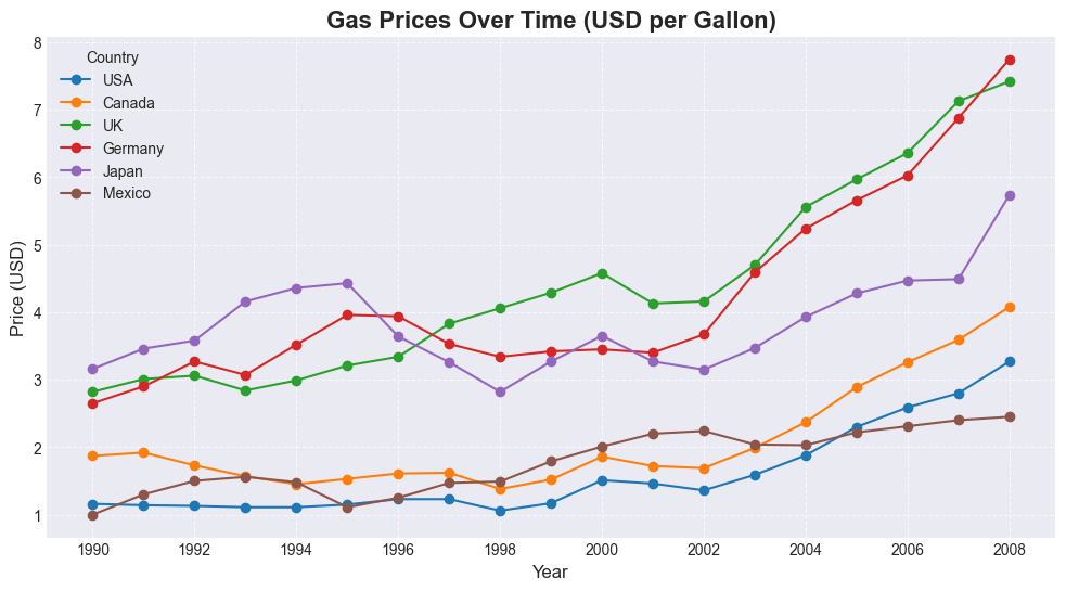
Line Graphs — e.g., gas price trends.
Bar Charts —
plt.bar(), with bar patterns viaset_hatch().Histograms —
plt.hist()to show data distributions, with adjustable bins.Pie Charts —
plt.pie(), including labels, percentages (autopct), custom colors, and slice separation (explode).Box and Whiskers Plots —
plt.boxplot()for comparing distributions, with options to style boxes.
Real-World Application with Pandas
Integration with Pandas is a key feature:
Loading Data: Read CSVs with
pd.read_csv().Example Datasets:
Gas Prices — country-level prices over time.
FIFA Player Stats — player attributes from the FIFA game.
Data Selection: Extract subsets before plotting, such as
gas[’USA’]or filtering withFIFA.loc[FIFA[’Club’] == ‘FC Barcelona’].
Teaching Approach & Takeaway
The course keeps a practical focus:
Documentation First: Suggests to use the official Matplotlib docs for functions and parameters.
Problem Solving: Search Google or Stack Overflow for specific issues, as is common in real development. This can now be augmented with AI tools.
This course covers the essentials of Matplotlib: how to create plots, customize them, work with multiple chart types, and apply them to real datasets through Pandas. It’s a practical introduction for anyone learning data visualization in Python. The datasets required to complete the matplotlib course can be downloaded from github . Additionally, you can also download cheatsheets for reference from the official site.